Dear Marketing and Sales Enablement,
But let’s face it, you’ve always sort of sucked at meeting materials. For years, you’ve been handing us eye charts and calling them “slides.” You’ve been pasting together PDFs of your brochures and calling it “the presentation deck.” Plus, you’ve been missing some of the visuals we need most. We love you, but we wouldn’t call meeting materials one of your strengths.
We get it – you have different jobs, and even though some of you came from sales, you’re a product of your environment. And the custom has been to overwhelm Clients with slides too busy to comprehend.
For a while, it was okay. We’d make chicken salad out of it. We’d make our own slides, ditch some of yours, and apologize for the rest as we tried to talk customers through it. We got by.
But now that we’re locked down, it’s not going to work. We’re confined to the small screen, and the things we got away with in person are just not going to fly when it’s coming through the laptop.
It’s time to rethink our meeting materials.
In the spirit of open communication, we want to be clear about our needs. Here’s what you can do to help us succeed in the online meeting environment.
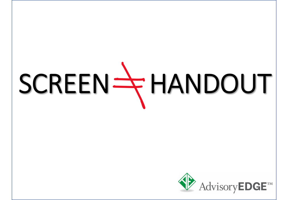
We need screens, not handouts.
There’s a big difference between handouts and screens. Handouts are detailed, rich documents Clients can digest at a pace and sequence THEY control. But in a meeting, WE need to guide the pace and sequence. That means giving clients a screen to look at, not a handout.
For example, look at television commercials. Advertisers communicate very clearly what you’re supposed to focus on – it’s all alone on the screen. The disclaimers they want you to gloss over are the handouts in small print at the end. Think screens, not handouts!
We need more, simpler slides.
If we were handing Clients the deck, it would be okay (not great) to give them fewer, richer pages. That’s a handout! But we’re not there anymore – we’re most likely limited to the screen. The phrase “more is better” doesn’t refer to the amount of information on a slide – it now refers to the actual number of screens. More, simpler screens are better.
We need build-free visuals.
We know it’s cool to do the fun animations and reveal points one-by-one on a slide. We’ve done it too. But it’s not awesome now, because introducing motion into an online meeting also introduces more sources of choppiness and delay. We’re also most likely NOT in presentation mode in PowerPoint (for better annotating and control), so presentation builds won’t work.
Instead, could you just convert that five-build slide into five separate slides, please? Thank you!
We need one idea per screen.
People who work in the small screen already (television producers, advertising agencies) know how to get you to focus on the most important thing – they make it the ONLY thing. We need that same kind of simplicity in our meeting visuals. Otherwise, we’re talking over an eye chart and somebody’s droning.
Even when it’s a chart or complex diagram, let’s just keep it to one per screen, okay? We think it may be a matter of simply disaggregating our existing slides into more, simpler slides.
We need bullets, not paragraphs.
Truth: It was ALWAYS hard to read some of the slides we put up on the big screen. On the small screen, paragraphs aren’t going to cut it, unless we’re in a small meeting with a LOT of time. In larger meetings like online presentations, we don’t have that kind of time.
Instead, we’d like more slides that look like this:
- One main idea
- 3-5 bullets
- 5-7 words per bullet
Like that! Please and thank you!
In closing, we still love you. We have ideas (and ideas from our Clients) on how to make our online meetings flow. Some of us are using advanced techniques like annotating, zooming, and guiding the reading, and we’d love to show you how we’re doing it.
Above all, we’re learning together. Let’s rethink our meeting materials and create more Client-centric communication for the online era.
Love,
Your Producers

